Shoppers have faithfully flocked to Oglethorpe Mall since 1969, the original mall in the Savannah. When it opened, it was a very basic and dark dumbbell shaped mall anchored by major anchors Belk Beery and Sears. Junior anchors were Adler's, Morrison's Cafeteria and Piggly Wiggly. A theater was also located on an outparcel, which later briefly became Fine's department store. The mall itself was one level, but both major anchors were two levels, though Belk would not open their second level for years after the store opened. The mall is located fairly close to downtown along the city's prime commercial corridor, but it is not near an interstate. In fact, the nearest interstate, I-516, ends a couple miles away from the mall. Nevertheless, its location on Abercorn Expressway (GA 204) proves to have remained a highly viable area. The development along Abercorn as a whole is highly unusual, since most suburban development tends to cluster around major interstate interchanges. In all, Oglethorpe has proved a highly successful survivor that shows no signs of slowing down.

Oglethorpe Mall is unique for several reasons. First, it was the first mall in not just Savannah, but all of Southeast Georgia. Second, its Belk Beery location was the very first mall-based Belk store in the entire chain. Mr. Beery, based in Wilmington, NC, built the store and opened it before the Belk brothers opened their own. Oddly enough, this store was never signed outwardly as "Belk Beery", but simply Belk. Third, it is a uniquely successful mall not to be located along a major interstate. Fourth, the mall proved to be a survivor despite its age and a long-standing threat from newer major competition that proved that age is nothing but a number.


Along with the first photo, these additional photos show the elaborate design and money dumped into creating a showy center court. In a city noted for its history and classic Victorian architecture, Oglethorpe could not exactly get away with a plain, simple and dumpy main court area in their malls. They came through in spades, and this still remains an extremely contemporary look.
While Oglethorpe Mall is only one story, it was expanded greatly in the 1980's. In fact, it was one of six expansions/renovations to the mall, which occured in
1974, 1977, 1982, 1985, 1992 and 2002 according to the mall's fact sheet. The 1974 renovation was a very small renovation adding six stores in the back of the center court tied to what is today the JCPenney wing. The 1977 renovation was tied to the closure of Adler's, which was replaced with the small section near the front of the mall known as the Prominade located near Belk, presumably where Barnes & Noble is today. In 1982, a new wing was constructed off of center court resulting in a new JCPenney and Levy's. Levy's was a very local department store with its only other known location in downtown Savannah. Levy's proved to be too small to compete and sold out to Jordan Marsh in the late 1980's. Their store at the mall was very small, thus proving to be inadequate and was later demolished. The 1992 renovation was the most dramatic, transforming the city's first mall into an beautiful mall with elaborate skylight and ceiling treatments, better than average floor treatments and a more elegant appearance overall than your usual mid-market mall. The 1992 addition also gave the mall a more competitive edge. The Barnes & Noble was added in 2002 and I'm guessing the food court as well. Other renovations aside from those renovations have been more subtle with the intent of keeping the mall completely up-to-date in decor and feel. In all, I have seen few malls this attractive.

The 1982 addition continues straight back from center court, located directly inside from the front mall entrance. All expansions to the mall went behind the original 1969 mall corridor. The second photo shows the bend in the pathway.
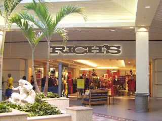
Oglethorpe is a lot like a grunge song...like the soft melodies erupting into hard chorus lines of music, low key corridors open into bright, showy and extravagant court areas. The mall has three of such court areas. This one is front of JCPenney, and originally in front of Levy's/Maas Brothers as well before it was torn down and expanded to a new Rich's.
Oglethorpe Mall changed because it had to. It dominated the market for a fairly long period of time, but this all changed when a larger, shiny new mall came into town:
Savannah Mall. Savannah Mall was a very real and ominous threat when it opened in 1990. Local residents feared that it would kill Oglethorpe Mall. It had four department stores, two levels and an elegant, contemporary design that kept the mall formidable for over a decade. Oglethorpe was old, had only one level and an outside appearance that suggested yesteryear. This is why Oglethorpe tried harder than most malls to stay ahead, further upscaling the appearance of the mall in 1992. The 1992 project was risky, but necessary, because the mall would have had no hope othewise. In fact, Oglethorpe did not get a solid foothold on the market until around 2005 when Savannah Mall proved that its anchor line-up was not so strong, and its location not so ideal.

The mall map is the best way to explain how a simple basic straight shot between Belk Beery and Sears became a major mall. The corridor pointing south was added in 1982 and the wing out to Macy's (former Rich's) in 1992. It is possible to travel the mall in a circular fashion by leaving the mall entrance next to Macy's and re-entering in the Food Court.
I made this map to show how the mall was laid out in the early years using 1975 as a reference point. The 1974 addition suggested that the back entrance was originally intended for a third department store anchor. Was Levy's always planned for the mall?
It must have been tough to be mall manager in those years considering that both malls had Belk, and any anchor loss at Savannah could have resulted in Oglethorpe losing an anchor of their own. 1998 must have been especially worrisome when Montgomery Ward closed their store there, leaving an opportunity for any anchor at Oglethorpe to jump ship. This was all put to rest in 2003 when Savannah Mall was starting to show its age and subsequently received a two-fold crushing blow. Both Parisian and Belk (no longer Beery) closed at the mall together almost at the same time Belk had three locations and was cannibalizing their sales, and Parisian was underperforming. This left the newer mall looking very precarious with only Dillard's left. Of course, the truth of the matter was that Oglethorpe was only in danger if they gave up. Oglethorpe always had the best anchors. It had the original and largest Belk, Sears, Rich's and JCPenney. In contrast, Savannah Mall had a sketchy anchor lineup with a more inconvenient Belk, over-expanded Parisian, doomed Montgomery Ward and Dillard's, which was less known and relatively new to the market at the time.

The Macy's wing blends in well with the rest of the mall. It seemed owners were careful to maintain a consistent design throughout to make the mall not seem piecemeal.
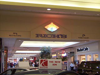
The Macy's court (the third court) features two entrances into the mall, virtually side-by-side.
Gracing all the courts are large, classic-styled fountains. Unfortunately, none were operational on my visit. Note that all of the courts give the names of the anchors accessable by the connecting corridors.
Leaving the Macy's wing re-entering the JCPenney wing.
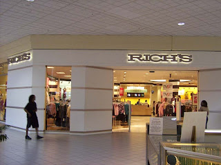
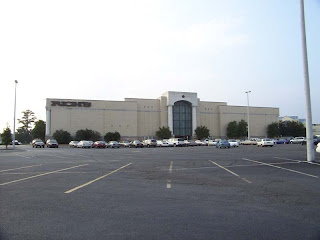
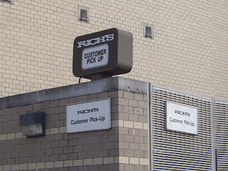
The story of how Rich's came to Oglethorpe Mall is the strangest. Levy's was first bought out by Jordan Marsh, a major Federated-owned department store located in Florida and New England. However, Jordan Marsh planned to leave to anchor Savannah Mall soon after opening there, so Maas Brothers, a Tampa-based chain, took over the spot. Maas Brothers also took over the Levy's store downtown previously. Family members were intermarried between the owners of the two chains, so Maas Brothers coming to Savannah was more than a coincidence. In 1990, Maas Brothers was consolidated into Burdine's, Federated's then remaining Florida division. Jordan Marsh never opened at Savannah Mall, however. That same consolidation that eliminated Maas Brothers also included them as well. Burdine's also posed a problem in the frenzy for Savannah as well. The problem was, Burdine's was exclusively in Florida while Rich's was most dominant in Georgia. At that point, the mall needed to expand to survive against new competition, thus the smaller Maas Brothers building was demolished, a new wing built, and a brand new two-level Rich's was built in lieu of Burdine's. This Rich's looks a lot like the stores of today, but was a better constructed building with actual block in lieu of stucco.

Looking along the Sears wing, which is noticeably wider than the added parts. Many of the stores on the right have outside entrances: a practice that fell out of favor for many years after the 1960's.
Arriving at Sears court, which like Belk's court is less elaborate, the mall continues on the left into the food court. Also, Old Navy is on the right. Over time, junior anchors took up several slots on the right (front). Old Navy also has an outside entrance. It previously operated as a McCrory's five and dime.
Savannah Mall has since lost many of the stores that were kept from Oglethorpe, and the two tended to overlap on many. It once had the Abercrombie & Fitch while Oglethorpe did not. Not long after the anchor closing spree at Savannah Mall, many of these stores either fled Savannah Mall or consolidated into Oglethorpe. Because of that, Oglethorpe today is nearly 100% leased: in fact, it is likely the healthiest mall in Georgia. Oglethorpe also gained a group of non-traditional anchors along the front of the mall that added significantly to its appeal including Barnes & Noble, Old Navy and Stein Mart. It even oddly holds onto its Piccadilly Cafeteria today, suggesting that the mall has something for everyone. The legacy Belk Beery also renovated its entryways, abandoning its basic arched canopies for a more elegant design more in tune with the legendary local architecture.
Looking down along the Belk (Beery) wing.
The Belk store at Oglethorpe Mall has been a baby of the company for a long time as one of their higher margin and well-established stores.
The older shoppers are provided a Piccadilly Cafeteria immediately outside the store. This originally opened as Morrison's with the mall, and it has obviously been substantially renovated since it was Morrison's. Why has the younger crowd so firmly shunned cafeterias?
Catty-corner to Piccadilly somewhat facing Belk is Barnes & Noble, which joined the mall in 2002. I am always happy when Borders, Barnes & Noble or Books-A-Million anchor a mall since the smaller mall-based book stores have mostly faded away. A decent book store provides a reason to shop at the mall besides clothing. The Barnes & Noble here was previously the "Promenade", which was built into what was originally Adler's department store.
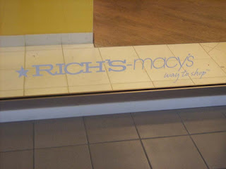
Since the 2003 fiasco, the only change to the mall was when Rich's was merged into Macy's: hopefully the last department store merger to affect that store. All other department stores at the mall were original. Pretty much all that Oglethorpe Mall lacks today is Dillard's, which is likely hanging on due to lack of space at Oglethorpe among Savannah Mall offering attractive leasing terms, pressure or a long-term lease. In fact, the only way that Dillard's could reasonably be built at Oglethorpe would be to create some very odd configuration such as tearing down and relocating one of the anchors or creating the confusing mall-thru setup on one of the anchors. Rest assured, Dillard's will jump if the opportunity arises such as any of the anchors closing or relocating.
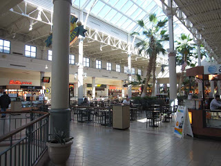
I am not back looking from the Sears wing into the food court. The ocean blue lighting is surreal, but very beautiful.
Design-wise, this has to be the prettiest food court I have ever seen. While food courts tend to be more comfortable and attractive than most of the mall these days, I want to give them accolades for this one. Of course, food was always the order of the day in this part of the mall...it previously housed a Piggly Wiggly.
Walking back from the food court is this wavy, neon overhang going back to the Sears wing. It seems Cumberland Mall in Atlanta employed this look into their renovation much more heavily.
In all, there is absolutely nothing I could say negative about Oglethorpe Mall. It has everything I like: a fascinating layout, attractive design, interesting fusion of past and present, a good choice of stores and it is located in one of the most historical and beautiful of American cities. This may sound like a promotion, but I have likewise been very harsh or dismissive about a few malls on my blog. The thing I like the most about it, though, is that it is a survivor. Most of us retail enthusiasts are disgusted when we see the classic mall in a city die because some new retail phenomenon came into town and crushed it along with everything around it. This time, it was the other way around. The older and wiser mall won the mall war, and a finer and classier mall was the result.
This open court area divides the outside entrance of the food court from the outside entrance into the Macy's wing. Macy's is the large anchor on the right.
A couple views along the front of the mall facing Abercorn Expressway.
The mall's main entrance. Note FYE also has an outside entrance.
Sears remains in its very original 1960's glory outside. I am not lying, I really think this design still looks cool. Sears did some interesting modernist stores in the 1960's.
Macy's (former Rich's) today seems to be mimmicking this design, though this store thankfully uses real block instead of cheap stucco.
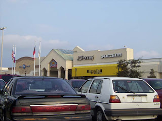
JCPenney, like Levy's before, was built too small. Levy's was demolished, but JCPenney remains, looking straight out of 1982. While plain, it still looks like new and somewhat eye-catching. Perhaps its just the era I was born in?
Belk Beery retains its classic arches on the back. Apparently it was too difficult to modify it when it was tied into the parking deck. The front, however, was drastically modified from my last visit. The front looks nice, but something just doesn't seem quite right about it to me.
Piccadilly was also greatly modified. I wish I knew what this looked like originally. I wish I could send modern architects and builders to Stucco Anonymous. It looks cheap, period.
The mall logo looks great, though the sign obviously lacks the Googie flair. The logo is fun, stands out and makes you want to shop there.
In another post, I will be adding pics taken in 2004 of Rich's at the mall. Because of the length of the post, I am posting this separately like I did with the Mall of Georgia post.

