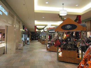
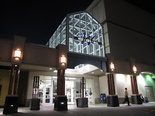
Knoxville was in a rather unique situation as a one mall town (aside from the downtown pedestrian mall), and the arrival of East Town mall may have been a treat, but it did not change the game at all. Always playing second fiddle, the main claim to fame for the new mall was that it had two levels throughout and a tent-like structure in the center court. Other than that, it was basically a conventional large five anchor mall opening with Proffitt's, Miller's, JCPenney, Sears and Service Merchandise. Service Merchandise was located in a two-level anchor, but only used the top floor with the bottom remaining vacant. Proffitt's location would be the third mall-based location, and it would also spell the beginning of the company's major expansion falling under new ownership by R. Brad Martin's RBM Acquisition Co.
The first photo features the center court, including a tent roof, plantation-style structure on the lower level, potted trees and a food court on the upper level known as "Cades Cove Cookout". The second photo shows the bottom level just outside of Sears.
Sears mall entrance clearly dates to the mall's construction considering it is more elegant than the usual ugly tile. I run across a few like this from time to time.
Getting photos that night was difficult, so this was the best shot I could get of the closed Dillard's, which opened as Miller's and later was Hess's. I seem to have covered most every mall that ever had Miller's as an anchor. This is the upper level of "Trout Court", part of the mall's "hillbilly" theme.
Here is a view along the second level of the Sears/Dillard's wing. Service Merchandise (not pictured) was also on this wing. Skylights here are just meh.
Mall maps always make it easier to describe these places. Note the three courts: University of Tennessee Court, Cades Cove and Trout Court.
Knoxville Center's modern mall entrance on the side facing I-640 was a 1997 update from the original entrance, which is photographed below.
To say that East Town Mall is inferior to West Town Mall would not be fair, because it is a very large mall with some distinctive design features. Aside from the tent structure in center court, the mall has a continuous uphill slope, which is represented on both levels throughout as well as a definite theme all its own. It was also the largest in the city and comparable in size to Hamilton Place in Chattanooga for over a decade, and it did quite well despite the fact that it was not terribly well located. The problem with East Town Mall is that the growth of the city has trended westward, and because of this there was never much of a hinterland surrounding the mall. The mall, however, sits in a far more visible location than East Town Mall situated within view of I-640, which was completed in the early 1980's.
The ramped sections of the mall being bi-level are pretty interesting. You see these a lot with one-level malls, but it is not common for two level ones. This is heading into center court.
Here is another view of center court, which somehow has been pegged to be like Cades Cove. If they're looking to recreate Cades Cove, then a rustic indoor mill with plush ferns and an indoor waterfall seem like what would be appropriate here, but they might be a tad tacky with the tent roof. It seems teflon roofs were all the rage in the 80's, but I imagine they are also a maintenance nightmare as well as more expensive to keep cool in the summer and warm in the winter. They are pretty cool looking, though...especially with the light effects on them.
Another ramped up section is found just past center court. The Proffitt's/Belk wing is on the right.
A view along the Proffitt's/Belk wing. I understand Proffitt's closed the lower level for a period of time.
The mall today definitely seems to have a theme despite the lack of fun features that West Town has. The mall took on a hillbilly theme, including naming the food court "Cades Cove Cookout" after the traffic-choked scenic valley in nearby Great Smoky Mountains National Park. To make things more confusing, the hillbilly theme is interspersed with University of Tennessee themed court on the west wing of the mall and the dubious "Trout Court" on the eastern end toward Sears and in front of the former Dillard's. University of Tennessee Court includes a sloping section with a mock-up of a football field, and giant orange "T" and city landmarks along with a basketball hoop. I guess that's one way to shoot two birds with one shot: play up on the over-hyped local culture and then play up college athletics pride. What effect this might have had seems rather negligible.
The upper level wing near University of Tennessee court.
Signs in the mall denoting anchors and the food court. The fake buzzard at the top is a little creepy.
JCPenney is an original anchor, and escalators climb up to the second level entrance.
Looking back into the mall from JCPenney. I don't see anything too unusual here.
Over the years, the mall has seen a few anchor changes. Miller's became Hess's in 1987 along with all of the other Miller's locations, and in 1992 the store was then sold to Dillard's since Proffitt's already had a two level store in the mall. Service Merchandise would then close with the chain in 1999, resulting in the first vacant anchor in the mall. Proffitt's then converted to Belk in 2006 along with all the other Proffitt's in the area, and Dillard's closed due to poor sales in 2008. However, Service Merchandise found new life as Rush Fitness within the past five years. Rush also took part of the long-vacant lower level, which made that part of the mall a little less spooky. The mall also continues to maintain A-list tenants despite an uptick and vacancies and decline in foot traffic.
College football fans that hate "Big Orange" should not be allowed in this court, which features a giant orange "T", a fake football field and a basketball goal elevated above the court. Coming from the land of red, a big letter "G" and a little white bulldog, this does seem somewhat foreign to me. Quotes surround the court as well, though I could not tell from the pics what they said. Coaches tend to be a source of inspiration for football fanatics.
Here, a fake football field takes over on the lower level. I would rather they just put in orange fountains with orange lights under the water. I guess this is a cost-efficient way of being creative.
More of University of Tennessee Court. You might slip and fall on this Rocky Top.
Here is a front entrance wing on the lower level across from Belk/Proffitt's. It looks more like kiosk hell to me. I think I shall dub this the "Dead Sea Wing".
Some people these days wonder if this mall is dying, but so far it seems to be hanging on. It definitely received a blow with Dillard's closing, but with both malls on the same team Simon either wants this mall to die or they intend to play up the strengths of each, and judging by the opening of Hollister right as Dillard's closed I am leaning toward the latter. One way that this mall may find new strength is the fact that Macy's is interested in finding a location in East Tennessee. They have no presence in the market currently, and they were recently blocked from both West Town Mall and Hamilton Place Mall by their competition Dillard's and Belk. However, with Dillard's vacating the slot at the mall, it leaves an opening for Macy's to enter the market. It is unknown, however, how serious the talks are or if Macy's is weighing the viability of that location. It would probably help if the mall was more developed surrounding it.
Escalators are located off-center in the center court area.
Here is Trout Court. Gasping for ideas, they wanted to trout something new, but so far this fishy design is a flop. This is also the most dead portion of the mall.
On the back side of the mall is this very 80's mall entrance aside form the newer logo. It was very difficult to photograph due to the presence of rowdy teenagers and security.
Still, I snapped this close-up shot of the cool mall entrance. The front used to have one like it, but it was changed to a woodsy mountain theme in the 1997 renovation.
My personal view of Knoxville Center, is that it is an attractive mall, but it could be a lot better. The 1997 renovation made the mall look too generic, and the presence of a dead anchor is not helping the mall, either. What is worse is the lack of development in that side of the city as well as the fact it is a poorer side of town with most of the money west of the city. Additionally, the mall has poor access compared to its cross-town rival, which recently had an interchange re-directed for easy access to the mall from I-40/75. In other words, the original developers must have built there on speculation of a growth boom, because I believe the mall would have done better built north of the city somewhat north of the interchange of I-75 and I-640 instead of closer to I-40 east. As the mall is pushing 30 years old, it clearly has some image problems, and a high profile shooting incident on October 8, 2008 did not help, either. Considering that all of the other anchors are holding on after Dillard's left and Macy's thinks they may want to get started there, it is clearly pulling adequate business, but what could be done to make this mall more popular?
View Larger Map


